Page 2 of 2 FirstFirst 12
Results 11 to 18 of 18
  1. #11
    GeorgeGFX's Avatar secret.club

    Join Date
    Nov 2010
    Country
    Posts
    15,462
    Thanked
    2,335
    Thanks
    5,080
    Bad render placement, read a tutorial regarding rule of thirds before you start working on actual tags.

    As for the tag itself, a lot of effects who were randomly included in the signature.
    None of the make the render blend or whatsoever.
    The flow is very messed up, you need to work on it.
    The font should never be put in corners, ever (the rule of thirds also applies for the text).
    The colors are pretty much giving me a strange feeling.

    An example of a neat tag made with Akali render;


    The colors are fitting perfectly, the background is not messed up at all, it creates a nice flow.
    The background is blurred and the foreground is sharpened with a lower opacity which makes the render blend even more and gives a warm feeling.
    Light sources are not messed up, usually corners are darkened and there's one spot most of the times put as a light source (above her head white 70-80px dot with lower opacity) and the text could be better but still blends with the tag itself.

    >>> Credits to Sikk408 @ DevaintArt <<<

  2. #12
    EpicKLF's Avatar Why am i purple?...

    Join Date
    Oct 2011
    Country
    Posts
    1,334
    Thanked
    22
    Thanks
    652
    Originally Posted by DeathHestia View Post
    I just said the second one was better but oke..

    Now i can understand you very well and actually believe youre capable of decent english and that youre older than 12. But then poop made me lose hope after what he just said...
    Originally Posted by U_Eat_PoOp View Post
    ncie very good


  3. The following user said thank you to EpicKLF for this useful post:

    U_Eat_PoOp (06-06-2014)

  4. #13
    Juriën's Avatar :(){ :|: & };:

    Join Date
    May 2010
    Country
    Posts
    4,064
    Thanked
    2,460
    Thanks
    1,164
    I don't think the overall look looks like some "nurse" theme :S

  5. #14
    EpicKLF's Avatar Why am i purple?...

    Join Date
    Oct 2011
    Country
    Posts
    1,334
    Thanked
    22
    Thanks
    652
    Originally Posted by George View Post
    Bad render placement, read a tutorial regarding rule of thirds before you start working on actual tags.

    As for the tag itself, a lot of effects who were randomly included in the signature.
    None of the make the render blend or whatsoever.
    The flow is very messed up, you need to work on it.
    The font should never be put in corners, ever (the rule of thirds also applies for the text).
    The colors are pretty much giving me a strange feeling.

    An example of a neat tag made with Akali render;

    http://fc06.deviantart.net/fs70/f/20...ow-d64bvrb.png

    The colors are fitting perfectly, the background is not messed up at all, it creates a nice flow.
    The background is blurred and the foreground is sharpened with a lower opacity which makes the render blend even more and gives a warm feeling.
    Light sources are not messed up, usually corners are darkened and there's one spot most of the times put as a light source (above her head white 70-80px dot with lower opacity) and the text could be better but still blends with the tag itself.

    The text can't really be placed anywhere else, otherwise it would disappear with the background or look wrong.
    And about the render placement. i know about the rule of thirds already, but it's just a habit of keeping the render to the far right, it's mostly due to giving some of the focus to the background where you would see the effects.
    I never really use c4d's to make up the majority of the signature before. Just finding a background and trying to make the render fit in it, and because of that; I don't have much control over flow and even blending.
    But you're right either way, i'll try and use a different style next time and emphasize on depth and things being in the foreground and in front of the render. Thanks!

    Originally Posted by Juriën View Post
    I don't think the overall look looks like some "nurse" theme :S

    idk. its League of legends, its always random, besides; i cant find a decent background of a hospital without dying anime characters...

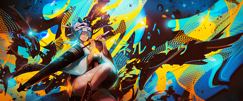
    Completly remade the signature with some depth and some rule of thirds in mind. how is it now?

    Last edited by EpicKLF; 06-06-2014 at 05:40 PM.


  6. #15
    DeathHestia's Avatar Nature

    Join Date
    Mar 2014
    Posts
    45
    Thanked
    2
    Thanks
    6
    could u make one for me in trade for smthing?

  7. #16
    Amzz's Avatar 7 ~ 15

    Join Date
    Jul 2013
    Country
    Posts
    1,061
    Thanked
    41
    Thanks
    153
    FK U ALL ITS MY SIG AND I THINK ITS AWESOME. OT I do like the red one better than the blue one lol >.>. And george ur sig is okay however i need nurse akali not that ratchet akali render used. (everything other then nurse akali is ratchet) cuz life.

  8. #17
    Donator

    Join Date
    Jun 2013
    Posts
    874
    Thanked
    27
    Thanks
    224
    Originally Posted by Amzz View Post
    FK U ALL ITS MY SIG AND I THINK ITS AWESOME. OT I do like the red one better than the blue one lol >.>. And george ur sig is okay however i need nurse akali not that ratchet akali render used. (everything other then nurse akali is ratchet) cuz life.
    why dont u use it then.

  9. #18
    Amzz's Avatar 7 ~ 15

    Join Date
    Jul 2013
    Country
    Posts
    1,061
    Thanked
    41
    Thanks
    153
    Originally Posted by Arances View Post
    why dont u use it then.
    the red one as in the red one epic made and i did use it.

Page 2 of 2 FirstFirst 12

Thread Information

Users Browsing this Thread

There are currently 1 users browsing this thread. (0 members and 1 guests)