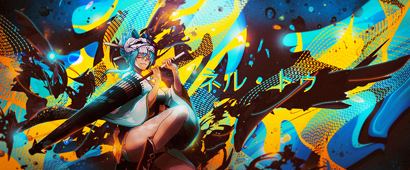
Some CnC from me;
This is without a doubt your best work so far, there are a few things that surely need improvement.
You applied the Rule of Thirds correctly on this one - both render & text placement.
You left the render unmodified, the hair is cut/unfinished, such parts could be easily fixed with a 5px soft brush and just play around to make the hair look realistic as if it's part of the render itself.
Learn to use burn/dodge tool, right now I see a light source from the upper right angle and meanwhile her left leg is darkened, the upper part that is.
Google what Photoshop Vignette is, it would help you a lot to create a good effect on such signatures that have only one light source, in short, it's a shadow trick for edges but not the render, help the depth itself.
The idea of using the render as a background was good, especially it being guassian blurred but you should have left some of those white spot dots visible, not entirely blurring them all for better depth.
Try using C4D's, you could have made a really great tag if you used C4D with dark purple / light red color and more effects overall and the GM text shouldn't have had a white stroke on it.
I would give you a solid 6.8/10 for the great for you've done, keep up the good work, you're definitely improving.


