Results 1 to 8 of 8
  1. #1
    Stimulus's Avatar Blue Burns Orange

    Join Date
    Aug 2012
    Posts
    13
    Thanked
    0
    Thanks
    0
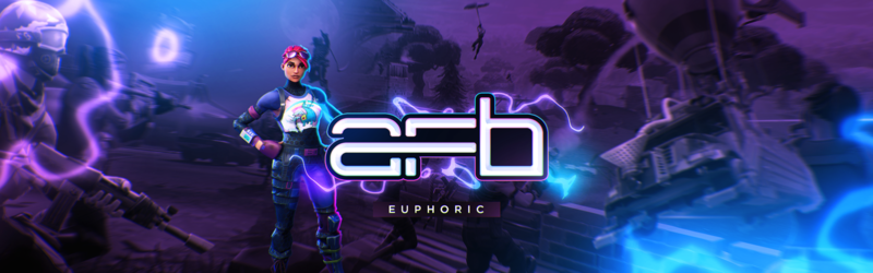
    I was bored and I realized I needed a signature for on the forums.
    Feel free to help me out, this was my first time trying the lighting source and I don't really know how I feel about it. I feel like I could've made the bottom a little bit darker and it would've made it look better.
    ~ CnC


  2. #2
    Afb's Avatar Aka Points

    Join Date
    Jun 2011
    Country
    Posts
    561
    Thanked
    36
    Thanks
    80
    I GOT a ready sig just need you to right my name on it can u ?

  3. #3
    Fresh's Avatar Supremeˇˇ

    Join Date
    Jun 2009
    Posts
    748
    Thanked
    13
    Thanks
    4
    A little too dark on the sides but still good nonetheless. In my opinion, try finding better fonts on dafont or something. The font's irk me a bit, I actually thought it said flogs until I read the title. Nice nice.


    IGN: Supremeˇˇ

  4. #4
    New Member

    Join Date
    Jul 2012
    Posts
    9
    Thanked
    0
    Thanks
    9
    weird size, it also needs some blending.

  5. #5
    Stimulus's Avatar Blue Burns Orange

    Join Date
    Aug 2012
    Posts
    13
    Thanked
    0
    Thanks
    0
    Originally Posted by Points View Post
    I GOT a ready sig just need you to right my name on it can u ?
    Send it to me and I can try to.
    Originally Posted by Fresh View Post
    A little too dark on the sides but still good nonetheless. In my opinion, try finding better fonts on dafont or something. The font's irk me a bit, I actually thought it said flogs until I read the title. Nice nice.
    Thanks for he info. I'll try to improve next time.
    Originally Posted by Black View Post
    weird size, it also needs some blending.
    Kind of a weak post, but I'll do my best.


  6. #6
    ProGame's Avatar Freestyler

    Join Date
    Feb 2011
    Country
    Posts
    484
    Thanked
    14
    Thanks
    51
    the left side looks too dark should add a bit more light

  7. #7
    Freestyler's Veteran

    Join Date
    May 2009
    Country
    Posts
    1,847
    Thanked
    65
    Thanks
    529
    I like it!

  8. #8
    Stimulus's Avatar Blue Burns Orange

    Join Date
    Aug 2012
    Posts
    13
    Thanked
    0
    Thanks
    0
    Originally Posted by ProGame View Post
    the left side looks too dark should add a bit more light
    Thank you. I'll try my best to change that in the future.
    Originally Posted by Boubble View Post
    I like it!
    Well thank you!


Thread Information

Users Browsing this Thread

There are currently 1 users browsing this thread. (0 members and 1 guests)