Little logo I made for a contest, but was too late q.q


Little logo I made for a contest, but was too late q.q


Nice o.o
oh shit.Originally Posted by Fish
its too nice!
(Y).

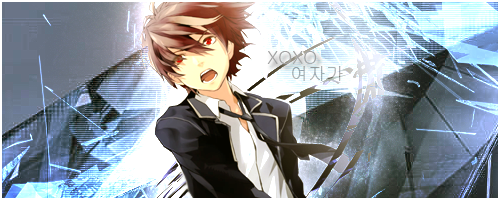
The lady shouldn't be holding those swords like that, since the only thing supporting her is a damn Letter!
The text itself is 2D while the render is 3D even though its a badly cut render, a little more work and it will be perfect. It's still a great idea and a very good presentation for what it is.
:3


Nice

10/10 Looks great for ME :=D
Y O L O

:o Nice!
hmm I wouldn't really count this as a logo.
anywho, I like the idea. I just don't think it's done nicely.
there's random area's that's low quality, such as the texture that has been clipped onto the text and the "freestyle" text.
if you would've covered the entire render with the texture it would've been better imo.
wow right and this is nice.

I like it!
Fall down seven times,
stand up eight
Turn the pain into power
There are currently 1 users browsing this thread. (0 members and 1 guests)