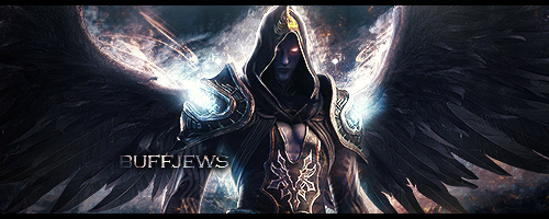
I originally made this for Paradise Heaven but since I didn't win and it turned out pretty decently, I've decided to use it for myself
Rate please, and help me improve xD


I originally made this for Paradise Heaven but since I didn't win and it turned out pretty decently, I've decided to use it for myself
Rate please, and help me improve xD

Creds to Lemonish^

Its sicck 7-8/10
Osuu (04-10-2013)

You can't achieve perfection
9.9/10
Osuu (04-10-2013)
Wow, thanks for the quick replies guys XD
Creds to Lemonish^
maybe put the "osuu" part a little higher n to the left, lota empty space
8/10, gj
Decided to burn a lot of calories today, so I set a fat kid on fire.
Like this? bloodgirl1.jpg

Creds to Lemonish^
this look sexy ;D 9/10 i guess. awesome background but weird font :/
bloodgirl2.jpgOriginally Posted by Claudia
This better?
Based on your feedback I have modified it amazingly!
Have a look and tell me what you think:

Last edited by Osuu; 04-10-2013 at 05:08 PM.
Creds to Lemonish^

This is said according to my personal tastes:
The tag is too wide.
The left side is plain, Or at least could have something of greater interest. Use of gradients with good contrasting / complimentary colours (such as blue / orange) could be nice.
I don't like the text (I don't like text at all tbh lmfaoo)
The right side is nice though, I like how you made the render blend in.
To improve it: Look at the first 3 lines + try using some blending effects to create more contrast and depth.
7/10 just a quick suggestion, when you put text in your sig try as much as possible to not put it on a corner of the sig, try to put it near the focal. And also always make the text simple.
There are currently 1 users browsing this thread. (0 members and 1 guests)