Comments are appreciated, happy new year folks.

Comments are appreciated, happy new year folks.
Taint (01-01-2014)

pls make sig for mr taint


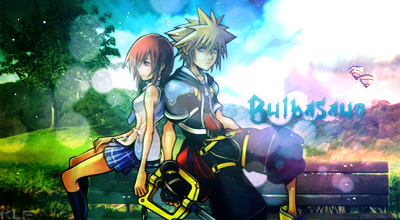
tree in background kinda low quality or somethin idk doesnt look nice

It's blurred to blend the render, it's not LQ.Originally Posted by Jaime Pls
OT;
Looks epic, abstract <3
>>> Credits to Sikk408 @ DevaintArt <<<


The render looks pasted somehow, maybe because it's too saturated for the background or too sharpened. And while the text looks nice, it's a bit hard to see/read, maybe a stroke or light shadows and even a dark outer glow would help. Also the bright flair doesn't go well with the background, because it seems dark for some reason, it goes well with the effects and the render tho. But those are just tiny issues.Ooverall its very appealing and thoroughly fantastic!
the render is 2 light while bg is 2 dark try to lighten a bit the bg or make the render a bit darker adding some shadows so it'll blend in more.


Looks very nice, I don't enjoy how the font looks though.
Me see what me can do.Originally Posted by Taint
Originally Posted by Jaime PlsThanksOriginally Posted by Georgeand yeah as George said, it's blurred.
Originally Posted by EpicKLFThanks. I agree, the background is very dark, but that is because it's very distracting. I had to do it to keep the attention focused on the render and the effects around it. About the text, I really did my best, if I were to make it any thicker it would've looked like crap, should try something different next time tho.Originally Posted by Arances
Thank yaOriginally Posted by Bulbasaurwell yeah I need to work more on my abilities of making an "appealing" text.
Hello.Originally Posted by Lemonish
i was buggin on an insane trip, my wifey showed me the light==
soul elevation thru the twin flame tip, yeah, it just us, we are feeling so right
in pursuit of justice from spaceships, we will always be whole in our Sameness
sewn like seeds of a star, on our wayback to Oasis
doing good deeds from a far, destroying the matrix
WE are not caught up in the matrix
WE have no fear, escaping that trick be so basic
this is our world, let us stage it
learn to love yourselves, then re arrange it
blessed, we have the chance to give others sight
we know trueth and what's wrong from what right
doin due diligence, burning the midnight oil all night
my wings are growing, aye embrace hers and take flight
Hi.Originally Posted by Buddhism
I chose this signature because it makes me laugh the way Scar says it.
On the commas thing, it's not like I'm writing an essay or something.
And I really don't see how using (") instead of (') is a horrible mess, when EpicKLF said my art piece is appealing as a whole, including the text. Yes it is not direct, but it is quoted.
But still, thanks. I like to interact with people who are better than me in English, as it is not really my main language.
Last edited by Lemonish; 01-02-2014 at 01:12 PM.
There are currently 1 users browsing this thread. (0 members and 1 guests)