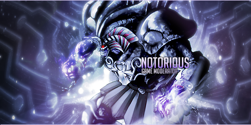
This time. Sakai started it and i adjusted it slightly afterwards. Cnc is greatly appreciated since we both need them '-'
Idk what text i supposed to put so i went with the most obvious one. (still looks ugly though)


This time. Sakai started it and i adjusted it slightly afterwards. Cnc is greatly appreciated since we both need them '-'
Idk what text i supposed to put so i went with the most obvious one. (still looks ugly though)


o.o is that sig taken cuz its hella nice 9.5/10 for me cuz I would like some purple in there like light and not too much just in my opinion. However looks good good job you two
Last edited by Amzz; 10-18-2014 at 08:18 AM.

It's nice.
Have you tried messing around with gradient maps / photo filters to add mood to it?
you just turn the opacity down to roughly 15-20% on that layer of the gradient map/photo filter. I usually use the blue-red-yellow preset for the gradient map. But you can use which ever one you feel like works best with the colours of the signature and just mess around with it.
Also i'd move the text left and up a bit so it overlaps her shoulder slightly and make the text a lighter colour.
You could also rotate the left plant c4d to roughly the same angle as the render so that it keeps the flow of the whole signature mostly in one direction. If theres a part of that c4d that sticks out when you rotate it (not going in the same direction as most of the c4d) then just erase it.
Apart from that it's great. 7/10
Last edited by Resort; 10-18-2014 at 11:12 AM.

Text Placement,the rule of thirds is missing. Depth is a bit missing,blurring such parts doesn't make it a depth,especially when it doesn't attracts our eyes into the main subject/the render.The image is flat,very flat.
I likey but something's missing and I can't put my finger on it.
I think the blue is too strong in this one D:

Creds to Lemonish^
Too much blue!
The focus is slightly off imo.. Don't really know what the main point is here.
If you're not sure wether the text looks alright, remove it

Originally Posted by Resort
Originally Posted by Amaethon
Originally Posted by Lemonish
Originally Posted by Osuu
Originally Posted by Pharaoh
Originally Posted by Luneth
Firstly, why too much blue? the original render is blue-ish, the background is blue (cuz from FF tidus and yuna wp) so I made it blue to blend with the background and such. (since I'm the one started it). And regarding to Resorts question, Yes. I used Gradients, curves, levels and any other adjustments. wanna see the original one? its not perfect.
Last edited by Azuki; 10-20-2014 at 04:20 AM.
@sakai
I prefer the version in ur sig than the one posted cuz the blue is simply too strong in it, making it hard to see everything and has a lack of focus i guess :0
Creds to Lemonish^
There are currently 1 users browsing this thread. (0 members and 1 guests)