Page 1 of 2 12 LastLast
Results 1 to 10 of 13
  1. #1
    New Member

    Join Date
    May 2013
    Posts
    50
    Thanked
    9
    Thanks
    12
    Hey guys, wanted to get a little opinion, ideas for improvements or anything else related to the making of these, and working with PS

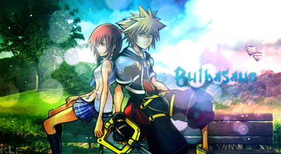
    I got bored at some point, and decided to give it a go here's the result:

    [IMG][/IMG]

    I didn't do any research or anything about proper image sizes or anything yet soo I know the size maay be a little big.

  2. #2
    Avatus Ifrit's Avatar the Legacy of Salem
    it doesn't look bad. I like it, actually for someone who doesn't normally make signatures, this is a great go at it. Good job!

    but for future reference, that text is a bit big. It doesn't look terrible, its just that it takes up like 1/6th of the picture o _ o it should be less in your face, or more blended with the picture so that its a comfortable fit

  3. #3
    Eddie's Avatar find ɟlǝsɹnoʎ

    Join Date
    Aug 2013
    Country
    Posts
    609
    Thanked
    747
    Thanks
    410
    Not too bad for a first try ^^ I'm not sure if your render is supposed to be that blurry/smudged, but if not maybe next time just make it a bit less blurry/smudgy. Just looks like it was edited a little too too much. All the details look smudged out basically xD can't tell what the character looks like

    I usually like 500x200 for size, but I play around with the numbers sometimes (as long as it's somewhat close to those numbers xD)

    Keep practicing though man. Practice makes better

    Eddie | Kiwi | Suiji

  4. The following user said thank you to Eddie for this useful post:

    Bulbasaur (11-22-2014)

  5. #4
    New Member

    Join Date
    May 2013
    Posts
    50
    Thanked
    9
    Thanks
    12
    Originally Posted by Tine Renard View Post
    it doesn't look bad. I like it, actually for someone who doesn't normally make signatures, this is a great go at it. Good job!

    but for future reference, that text is a bit big. It doesn't look terrible, its just that it takes up like 1/6th of the picture o _ o it should be less in your face, or more blended with the picture so that its a comfortable fit
    Appreciate it! Will try and play around with it see if I can blend a little more with the rest of the image.

    Originally Posted by Eddie View Post
    Not too bad for a first try ^^ I'm not sure if your render is supposed to be that blurry/smudged, but if not maybe next time just make it a bit less blurry/smudgy. Just looks like it was edited a little too too much. All the details look smudged out basically xD can't tell what the character looks like

    I usually like 500x200 for size, but I play around with the numbers sometimes (as long as it's somewhat close to those numbers xD)

    Keep practicing though man. Practice makes better
    Awesome! , yea there's some bits and pieces I would like to adjust... I think the character's resolution was slightly low in comparison to the rest so I had to try and work that away a little. Working on a smaller size may actually help :p.

    Thanks a lot for the thoughts, I just noticed how sensitive making these can be, as the appearance can look so different on different monitors...
    I feel the blue-ish fog may be a little too crowdy, and there's some line's here and there that mess with the actual depths I wanted to create...

  6. #5
    Azuki's Avatar Dazed

    Join Date
    Apr 2014
    Country
    Posts
    609
    Thanked
    338
    Thanks
    273
    Well, to be honest,
    you should like made the render to pop out and not be blurred and the thing around it. the spiral or something it should be the one that's to be blurred.
    anyways this is a nice start. gj.

  7. #6
    Ranger's Avatar Răńgěr

    Join Date
    Oct 2013
    Country
    Posts
    338
    Thanked
    116
    Thanks
    37
    Nice Signature D Images

    Credits to CharmHye for the avatar pic.

  8. #7
    Banned

    Join Date
    Aug 2014
    Country
    Posts
    2,744
    Thanked
    133
    Thanks
    657
    weird colors. looks like you focused more on the sword glow other than the other parts of the image
    ~ like azuki said, the spirals should be blurred, not the figure
    ~ not bad for a newbie thou

  9. #8
    Bulbasaur's Avatar Gang Gang

    Join Date
    Nov 2013
    Country
    Posts
    404
    Thanked
    328
    Thanks
    163
    Other than the major smudging and blurred render, it is very nice. As Eddie said, not sure if it is supposed to be like that, but that is the only thing throwing me off. Also another thing is, the sword glow is a little much, it was the first thing I saw when I looked at the picture. Tone that down a bit and I'm sure someone would love to use that sig. Once again, very well done. Especially for a first attempt. Keep at it and you will be making masterpieces.

  10. #9
    Yahoos's Avatar New Member

    Join Date
    Nov 2014
    Posts
    10
    Thanked
    2
    Thanks
    0
    Nice Signature (Y)

  11. #10
    Pharaoh's Avatar Creative Minds Speak

    Join Date
    Oct 2014
    Posts
    434
    Thanked
    45
    Thanks
    70
    I suggest you 450x250. "Little" is 350x150.


Page 1 of 2 12 LastLast

Thread Information

Users Browsing this Thread

There are currently 1 users browsing this thread. (0 members and 1 guests)