Page 1 of 3 123 LastLast
Results 1 to 10 of 21
  1. #1
    GeorgeGFX's Avatar secret.club

    Join Date
    Nov 2010
    Country
    Posts
    15,461
    Thanked
    2,332
    Thanks
    5,080
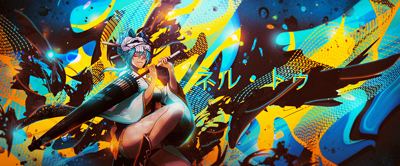
    So I've decided to open PS today since I had free time, added some random resources but at the end the render was not fitting so I decided to change it.
    Sadly the new render isn't fitting well and I have no idea how to make it blend more, I'm open for suggestions.


    >>> Credits to Sikk408 @ DevaintArt <<<

  2. The following 3 users say thank you to GeorgeGFX for this useful post:

    Ao (05-19-2015), Azuki (05-09-2015), Eagle (05-09-2015)

  3. #2
    New Member

    Join Date
    Feb 2015
    Posts
    17
    Thanked
    0
    Thanks
    0
    too chaotic

  4. #3
    GeorgeGFX's Avatar secret.club

    Join Date
    Nov 2010
    Country
    Posts
    15,461
    Thanked
    2,332
    Thanks
    5,080
    Originally Posted by x24680i View Post
    too chaotic
    Comments like that one won't help me anyhow.

    >>> Credits to Sikk408 @ DevaintArt <<<

  5. #4
    kirin's Avatar New Member

    Join Date
    Aug 2013
    Posts
    42
    Thanked
    0
    Thanks
    7
    how doesn't it? you could use less random stuff in the back and make it less chaotic. .???

  6. #5
    Azuki's Avatar Dazed

    Join Date
    Apr 2014
    Country
    Posts
    609
    Thanked
    338
    Thanks
    273
    Originally Posted by Choropoppin View Post
    So I've decided to open PS today since I had free time, added some random resources but at the end the render was not fitting so I decided to change it.
    Sadly the new render isn't fitting well and I have no idea how to make it blend more, I'm open for suggestions.

    http://i.imgur.com/Olbrvs7.png
    It's kinda chaotic for me, well uh remove some of the elements like the fractals? Also the overlapped FX on the renders hands bugging me. it destroys the smoothness of your render. to blend it, I may suggest that you should put elements with the same color as your render. uh, try to clipmask some of those splatters though. Also, hm. I think this is going to work vertically, but this will also work that way, its just really busy. the background I mean.

  7. #6
    GeorgeGFX's Avatar secret.club

    Join Date
    Nov 2010
    Country
    Posts
    15,461
    Thanked
    2,332
    Thanks
    5,080
    Originally Posted by Sice View Post
    It's kinda chaotic for me, well uh remove some of the elements like the fractals? Also the overlapped FX on the renders hands bugging me. it destroys the smoothness of your render. to blend it, I may suggest that you should put elements with the same color as your render. uh, try to clipmask some of those splatters though. Also, hm. I think this is going to work vertically, but this will also work that way, its just really busy. the background I mean.
    Yeah figured the background doesn't match but that's because I put the new render in ;-;, I tried a lot of renders but none of them works..
    Let me know when you're on Skype, I'll give you TeamViewer so you can help me q.q

    >>> Credits to Sikk408 @ DevaintArt <<<

  8. #7
    Taokaka's Avatar Junior Member

    Join Date
    Dec 2012
    Posts
    156
    Thanked
    24
    Thanks
    112
    For things in the foreground, I'd recommend using hard brushes to erase. Having a lot of half baked effects on top of the render adds to the messy-ness. As for the background I'd say merge some of the layers and put them in clipping masks(maybe splatter brushes or a vector shape). Make sure the masks are close ish to the render and take a couple of them and put them in front of the render going along the bottom(and a couple going over the shoulder areas for some extra depth). After that, redo the lighting in the background so that it doesn't conflict with the lighting you already have going on. I'd probably sharpen it just a little bit.

    The effects are nice though, once you clean it up it'll look sick. If you can't picture some of the tweaks you can hook me up with the PSD.

  9. #8
    kirin's Avatar New Member

    Join Date
    Aug 2013
    Posts
    42
    Thanked
    0
    Thanks
    7
    it looks like you just pasted whatever you could find everywhere, i think u should read some tutorials about clutter and the text is really ugly :/ overall eyesore but not to worry theres always time for improvement!
    Last edited by kirin; 05-11-2015 at 04:39 AM.

  10. #9
    GeorgeGFX's Avatar secret.club

    Join Date
    Nov 2010
    Country
    Posts
    15,461
    Thanked
    2,332
    Thanks
    5,080
    Originally Posted by kirin View Post
    it looks like you just pasted whatever you could find everywhere, i think u should read some tutorials about clutter and the text is really ugly :/ overall eyesore but not to worry theres always time for improvement!
    I lol'd, someone got butthurt from CnC's.

    >>> Credits to Sikk408 @ DevaintArt <<<

  11. The following 3 users say thank you to GeorgeGFX for this useful post:

    Ao (05-19-2015), Michi (05-11-2015), Notorious (05-11-2015)

  12. #10
    Lorrainé's Avatar 完全に不完全な

    Join Date
    Jun 2013
    Country
    Posts
    1,340
    Thanked
    608
    Thanks
    691
    am i the only one who likes it as it is except for the text
    Tomorrow comes today

Page 1 of 3 123 LastLast

Thread Information

Users Browsing this Thread

There are currently 1 users browsing this thread. (0 members and 1 guests)