Results 1 to 10 of 10
  1. #1
    Oculus's Avatar The Eye Above

    Join Date
    Apr 2014
    Country
    Posts
    330
    Thanked
    4
    Thanks
    91


    Rate and CnC it!

    EDIT V2
    Last edited by Oculus; 03-25-2016 at 08:09 AM.

    ↓ Conspiracy tbh ↓
    Spoiler!

  2. The following user said thank you to Oculus for this useful post:

    Amers (03-25-2016)

  3. #2
    Amers's Avatar Freestyler

    Join Date
    Aug 2015
    Country
    Posts
    588
    Thanked
    714
    Thanks
    416
    idk how people want CnC u spend like 30 mins making a cute sig but since ur a bit unexperienced it looks a bit shit then some big shot guy roasts ur sig lol wtf?
    my opinion: the reflection effect no like
    too big
    nice render
    the black things should be coming out of the render not just everywhere
    good blur + purple background i like

    decent signature
    "Nobody cares, work harder"
    Love everyone, but trust no one

  4. #3
    Walko's Avatar New Member

    Join Date
    Mar 2016
    Country
    Posts
    2
    Thanked
    0
    Thanks
    0
    The reflection effect looks super weird since it's reflecting off of nothing, basically. Everything else looks pretty good.

  5. #4
    Oculus's Avatar The Eye Above

    Join Date
    Apr 2014
    Country
    Posts
    330
    Thanked
    4
    Thanks
    91
    Yea about the text I just wanted to try something to make it better. I like big sigs. Don't really see the point of smaller sigs tbh.

    ↓ Conspiracy tbh ↓
    Spoiler!

  6. #5
    Michi's Avatar spread kindness

    Join Date
    Jun 2014
    Country
    Posts
    3,050
    Thanked
    1,351
    Thanks
    1,072
    You should try doing an outline of the character to distinguish it from that black/red/blue C4D.
    The reflective text would've gone better with it if you had something to reflect it off of (??)
    Decent signature.


  7. #6
    Eeksdee's Avatar Best Asian Male Dora

    Join Date
    Aug 2011
    Country
    Posts
    1,913
    Thanked
    898
    Thanks
    414
    It looks like you just cut and paste picture and shapes into a background with some effects.

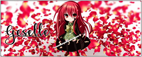
    Thank you and credit ~ GeorgeGFX


  8. #7
    Oculus's Avatar The Eye Above

    Join Date
    Apr 2014
    Country
    Posts
    330
    Thanked
    4
    Thanks
    91
    Originally Posted by Virgo View Post
    It looks like you just cut and paste picture and shapes into a background with some effects.
    Yea i see what you're saying. It doesnt have flow.

    ↓ Conspiracy tbh ↓
    Spoiler!

  9. #8
    Carlo's Avatar LOSER! No Cat in the Hat!

    Join Date
    Oct 2015
    Country
    Posts
    127
    Thanked
    14
    Thanks
    19
    Originally Posted by Oculus View Post
    Good job!

  10. #9
    Pharaoh's Avatar Creative Minds Speak

    Join Date
    Oct 2014
    Posts
    434
    Thanked
    45
    Thanks
    70
    Needs depth and flow,also reflections need to be on to something. The render hasn't been edited,background looks like C4Ds been scattered around it without any measures. Geez I don't know what to say and where to start but you should practice more.


  11. #10
    Jungae's Avatar Death is near.

    Join Date
    Nov 2011
    Country
    Posts
    328
    Thanked
    21
    Thanks
    44
    6/10 its ok not best not the worst.
    Keep slaving through the work it'l get better!

Thread Information

Users Browsing this Thread

There are currently 1 users browsing this thread. (0 members and 1 guests)