Results 1 to 9 of 9
  1. #1
    Resort's Avatar Aloha

    Join Date
    May 2011
    Country
    Posts
    3,449
    Thanked
    1,769
    Thanks
    1,235
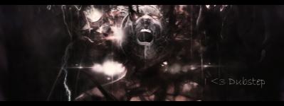
    heres my new sig i just finished
    Please rate it from 1-10

    thanks :>

  2. #2
    Joeyy's Avatar Donator

    Join Date
    Aug 2009
    Posts
    2,022
    Thanked
    84
    Thanks
    243
    Lightsource is wrong. The shit behind the text is weird too.


  3. The following user said thank you to Joeyy for this useful post:

    Tamahome (08-20-2011)

  4. #3
    Omar's Avatar BARRELS! WUT R U DOIN?

    Join Date
    Jun 2009
    Posts
    4,098
    Thanked
    894
    Thanks
    663
    i like it but i agree with joeyy
    the shit behind the text sucks XDD
    8 - 10 <3


  5. #4
    JShaya's Avatar Freestyler's Senior

    Join Date
    May 2009
    Posts
    3,118
    Thanked
    885
    Thanks
    270
    It would probably look ok if there was some Depth to it, And also if it wasn't the same color.
    6/10
    (That's not on my Level So don't think your Pro ^^)

    It would probably look ok if there was some Depth to it, And also if it wasn't the same color.<br>6/10<br>(The text is not on my level, if it was I'd put you a 1 or 1.5/10)<br><br>

  6. #5
    Modcrusher

    Join Date
    Mar 2011
    Posts
    2,508
    Thanked
    829
    Thanks
    681
    I like it ^^
    7/10


  7. #6
    Tamahome's Avatar New Member

    Join Date
    Aug 2011
    Posts
    65
    Thanked
    14
    Thanks
    4
    Ehhh 4/10
    The flow is kinda weird and it looks like someone took a shit on that "VExX" text.
    Last edited by Tamahome; 08-23-2011 at 12:16 AM.
    http://i105.photobucket.com/albums/m236/BURNINATOR8/Siggies/ilovedubstep.png

  8. #7
    Ekital's Avatar Ultima

    Join Date
    Feb 2011
    Country
    Posts
    1,359
    Thanked
    256
    Thanks
    444
    2/10

    No Flow
    Messed up gradients / Color scheme
    Lighting is all ****ed up
    Why add Esperanto in the corner it looks like shit.
    Contrast is messed up


    Basically just spam with no knowledge.

    You get 2 points for being able to open photoshop.

  9. The following 2 users say thank you to Ekital for this useful post:

    Lenny (08-31-2011), Tamahome (08-23-2011)

  10. #8
    Creoby's Avatar I'm an Oldschool power!

    Join Date
    Jan 2011
    Posts
    309
    Thanked
    102
    Thanks
    52
    Text could be better but its nice anyway. 6/10
    "A Warrior is not measured by its kills, but by its heart."
    Forever Esperanto
    clan member.

  11. #9
    Lucky's Avatar OFWGKTA

    Join Date
    Dec 2010
    Posts
    1,228
    Thanked
    397
    Thanks
    128
    Originally Posted by Ekital View Post
    2/10

    No Flow Agree
    Messed up gradients / Color scheme Agree
    Lighting is all ****ed upAgree
    Why add Esperanto in the corner it looks like shit.Agree
    Contrast is messed upAgree


    Basically just spam with no knowledge.Agree

    You get 2 points for being able to open photoshop.LOOOOOOOOOOOOOOOOOOL


    Agree with Ekital.. becuse he pro and funny and harsh while doing his rating ^^

Thread Information

Users Browsing this Thread

There are currently 1 users browsing this thread. (0 members and 1 guests)