hey guys i needs some tips im not sure how to add Text yet getting to that stage soon and idk where to get good texts so here


hey guys i needs some tips im not sure how to add Text yet getting to that stage soon and idk where to get good texts so here

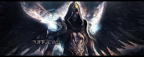
I think you shouldnt over edit the bg behind the focal too much.
More effects should go over the render.
And you need to use the sharpening tool.
FG Account:
^AC^9hap^As^2
HappySnowman
I like the idea of it, i would place the text following the direction of the arrow, and a subtext under it, so you would get something likeOriginally Posted by Rouge
l........l <---
.....l...........l
Just an idea, anyway, its pretty good
Edit: try using some lightning effect to make it focus and flow.
Y'ALL MUST'VE FORGOT
I am a figure of blood lust, an immortal entity
Forget 9000, my power level is infinity.

It's better than your first, that can be said for sure, though you need to kinda back off the blending effects and focus more on the renders. (Smudging, sharpening, blurring, etc. instead of the glowing effects and shit)Originally Posted by Rouge
You've done better with the last background aswell, though try and use the color dropper and make the background a more similar color to the render.
Try and always make the render itself the focus point, maybe try blurring around it, or darkening it with a black brush around.
The text will always be a bitch, so when you start making signatures, don't worry too much about the text. Just make sure not to over do it with effects, and make it blend in smoothly. Also try and use the 1/3's rule when placing it. Don't put it all the way on the edges, but not right in the middle. Just look at a few of the signatures on this forum and you'll know what I mean.
buffjews (06-20-2013)
Wow thanks guys I really appreciated this ill try harder to not overdo and smudge etc more

I need such tips too
14-14-08
But first, LET ME TAKE A SELFIE!
Bar must be 2pro https://freestylersworld.com/showthr...=1#post1007929
Dean must be legend https://freestylersworld.com/showthr...light=dianabol
I like the conceptD
But it seems over-repetitive and lacking moar effect thingies
You need more cool light effects and fractal thingies to make it look good C:

Creds to Lemonish^
The smudging of the bg doesn't match the flow of the render. Follow the flow of the arrow next time.
Colours clash and having that straight line at the end of her cape really doesn't help.
There are currently 1 users browsing this thread. (0 members and 1 guests)