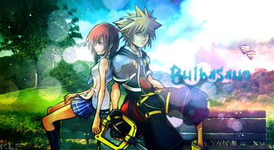
As for the composition of your pieces, work with the rule of thirds more. everything is either highly skewed to one side, or is fairly close to the center. No tension or too much tension is created this way.
For color work, make sure your hues stay within the analogous spectrum of things, then use complementary colors to bring out those colors. So for example on the last one, your colors you use orange, purple, yellow, and green which creates conflict. Just focus on hues within 2-3 steps of each other, then a single hue directly across can be used to create contrast in your piece. Make sure you don't use too many tints as well, lighting the whole composition (especially when it is being placed in a dark setting such as this forum) can make it seem overdone.
http://www.artsparx.com/images/colorwheel-mini01.gif


 but i agree on the third one tho.