I don't like doing text anymore, looks way better without it in my opinion.
sup
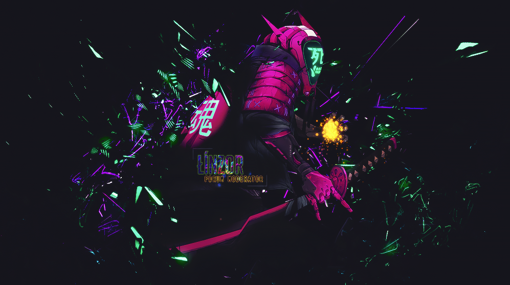
dA Signature Link: http://resortgfx.deviantart.com/art/...ture-646216043
Hopefully it gets entered into a daily signature contest and does well.


I don't like doing text anymore, looks way better without it in my opinion.
sup
dA Signature Link: http://resortgfx.deviantart.com/art/...ture-646216043
Hopefully it gets entered into a daily signature contest and does well.
Last edited by Resort; 11-17-2016 at 05:49 PM.
Charm Hye (11-17-2016), GeorgeGFX (11-16-2016), k1ng_musa (11-17-2016), Nogamenolife (11-17-2016), Ricky (11-17-2016), serpento (11-22-2016), TomasEdison (11-24-2016)
Looking good.

wow amazingggg i like it damm

I don't like this part
It looks like she got one huge leg at the center of her body lmao, or if I angle my head the leg looks normal but still looks like one leg short.


Better style, quality and colour compared the the current signature you are using (not sure why you aren't using Mage Girl).
Personally I think this is your best piece so far, really like how you made a difference between light and dark around the mage.
Originally Posted by Linzor
Black lines are the edges of the leg. The other leg is hidden under the dress:
This is what the full plain render looks like:

Last edited by Resort; 11-17-2016 at 05:54 PM.


looking so good.
Last edited by braazts; 11-17-2016 at 05:58 PM.
Idk I still think it just looks like a huge cannon right in the middle lmao. I think I would prefer it more if you showed more of the legs, just my opinion.


As always amazing work jess
Credits to GeorgèGFX for this beautiful signature
Nice work!
There are currently 1 users browsing this thread. (0 members and 1 guests)