Originally Posted by RainSama View Post
http://i.imgur.com/Jh4fd9n.png

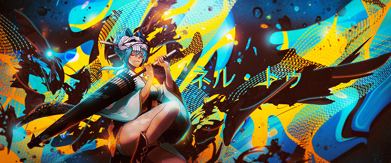
As stated above, Contras is way to dark.
The blue light looks really manipulated.

Over sharped, Makes it look worse then it already is.

The background is to much.


The render is nice, The idea of making some part's lighter then the rest is nice but you just made it way to dark.
It doesn't look eye friendly. Abstract feel would be even better if you actually made some part's of the render abstract.


Some real CnC there, Enjoy it.
I agree that the contras is too dark, I should have fixed colors actually.
Over sharpened, that's how it should be, not sure how the style is called but I saw a few others like that.

The background is too much? I don't get you.

And about the spots which are dark, I also agree but it was night, I was tired and didn't feel like fixing it lol.